CHIAK PACER
The First Chapter of PACER in WONJU : THE ORIGIN BASECAMP
PACE THE CITY, LEAD THE WAY
페이서의 시작 계기
“왜 원주에는 부산의 발란사, 대구의 EPLC처럼 지역의 감성을 시각적으로 표현하고, 사람들을 하나로 묶어줄 브랜드가 없을까?” 이 단순한 질문이 치악페이서의 시작점이었습니다. 원주는 강원도의 대표 도시이자 교통, 교육, 행정의 중심지이지만 그에 비해 도시를 상징하는 시각적 이미지나 문화적 정체성은 적은 편이었습니다. 관광지처럼 극적인 매력도 없고, 지역민들이 고향에 대한 애정을 적극적으로 드러내는 문화도 비교적 드물었습니다. 저는 그런 점들이 단지 ‘자부심의 결핍’이 아니라, 감정을 모을 구심점이 부족한 것이라 생각했습니다. 그래서 디자이너로서 이 도시에 흐르는 감정과 분위기를 시각화하고, 사람들이 연결될 수 있는 로컬 브랜드를 만들어보고자 했습니다.
PACE THE CITY, LEAD THE WAY
The Origin of Chiak Pacer
“Why doesn’t Wonju have a brand that visually captures the city's unique sensibility and brings people together—like Balansa in Busan or EPLC in Daegu?” This simple question was the starting point for Chiak Pacer. Although Wonju is a key hub for transportation, education, and administration in Gangwon Province, it lacked a distinct visual identity and cultural presence by comparison. It doesn't have the dramatic pull of a typical tourist destination, and a culture where locals openly express love for their hometown was relatively rare. I believed this wasn't due to a 'lack of pride,' but rather the absence of a central focal point to gather those shared feelings. As a designer, I wanted to visualize the subtle mood and emotions flowing through this city, building a local brand where people could truly connect.
‘Chiakpacer’ 네이밍과 디자인의 의미
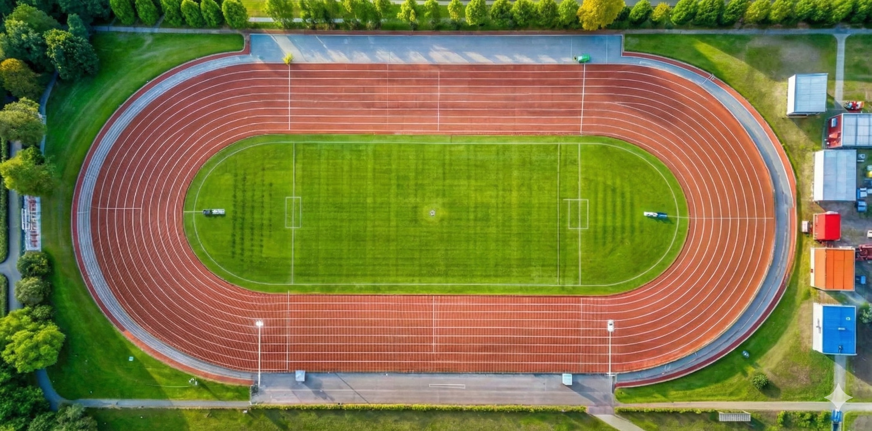
치악페이서는 원주를 기반으로 다양한 서브컬처와 러닝 문화를 아우르며, 지역의 취향과 이야기를 담아내는 브랜드입니다. 브랜드명은 원주의 상징인 ‘치악산’과 선두에서 방향을 제시하고 이끄는 사람, 모범이 되는 사람을 뜻하는 ‘PACER’를 결합해 만들었습니다. 지역성과 행위성을 동시에 담은 이름입니다. 브랜드의 로고 또한 우리의 철학을 시각화했습니다. 운동장 트랙이 가진 기하학적인 라인에서 모티브를 얻어, 트랙의 라인이 부드럽게 낙하하며 만들어내는 유기적인 실루엣을 정제된 조형 언어로 재해석했습니다. 원주라는 거대한 트랙 위를 각자의 속도로 달리는 사람들의 역동성과 연결성을 담아내고자 했습니다.
The Meaning Behind the Name and Design of 'Chiak Pacer'
Based in Wonju, Chiak Pacer is a brand that encompasses diverse subcultures and running culture, bringing together the region's unique tastes and stories. The brand name combines "Chiaksan," the iconic symbol of Wonju, with "PACER"—a word that represents someone who sets the direction at the front, leads the way, and inspires as a role model. It is a name that carries both locality and action. Our logo visually reflects this core philosophy. Taking inspiration from the geometric lines of a running track, we reinterpreted the organic silhouette created by its smoothly flowing curves into a refined visual language. Through this design, we sought to capture the dynamism and connection among people running at their own pace on the grand track that is Wonju.
‘Chiakpacer’ 가 바라보는 원주, 그리고 우리의 가치
원주는 참 평온한 도시입니다. 생활 인프라도 잘 갖춰져 있고, 자연도 가까워 일상을 살아가기엔 더없이 좋은 환경입니다. 하지만 도시 규모나 인구수에 비해 창작 활동이나 도전적인 움직임은 상대적으로 적고, 무언가를 ‘누릴 수 있는 공간’은 많지만 ‘만들어가는 문화’는 부족하다고 생각했습니다. 치악페이서는 단순한 러닝 브랜드가 아닙니다. 우리는 러닝을 경쟁이나 기록을 위한 스포츠가 아니라, 삶을 대하는 태도로 바라봅니다. 우리가 말하는 ‘PACER’는 단순한 러너를 넘어, 자신의 자리에서 긍정적인 영향을 주는 사람들입니다. 달리기를 좋아하는 사람, 가게를 운영하는 사람, 환경을 위해 행동하는 사람, 새로운 문화를 만들어가는 사람 등 각자의 방식으로 원주를 움직이는 사람들 모두가 ‘치악페이서’입니다. 원주 안에서 작은 시도들이 모여 지역 문화가 형성되는 과정을 만들어가고자 합니다.
How 'Chiak Pacer' Views Wonju, and Our Core Values
Wonju is a genuinely peaceful city. With well-developed infrastructure and nature close by, it provides a wonderful environment for daily life. However, relative to the city's scale and population, creative activities and bold initiatives are somewhat scarce. While there are plenty of places to 'enjoy' culture, I felt there was a shortage of a culture being actively 'created.' Chiak Pacer is not just a running brand. We view running not as a sport defined by competition or records, but as an attitude toward life. For us, a 'PACER' is more than just a runner—it refers to individuals who spread positive influence wherever they are. Everyone moving Wonju in their own way—whether by running, running a shop, taking action for the environment, or cultivating a new culture—is a 'Chiak Pacer'. Our goal is to build a process where these small efforts gather to shape a vibrant local culture.
033 Project : 당신을 위한 배번표
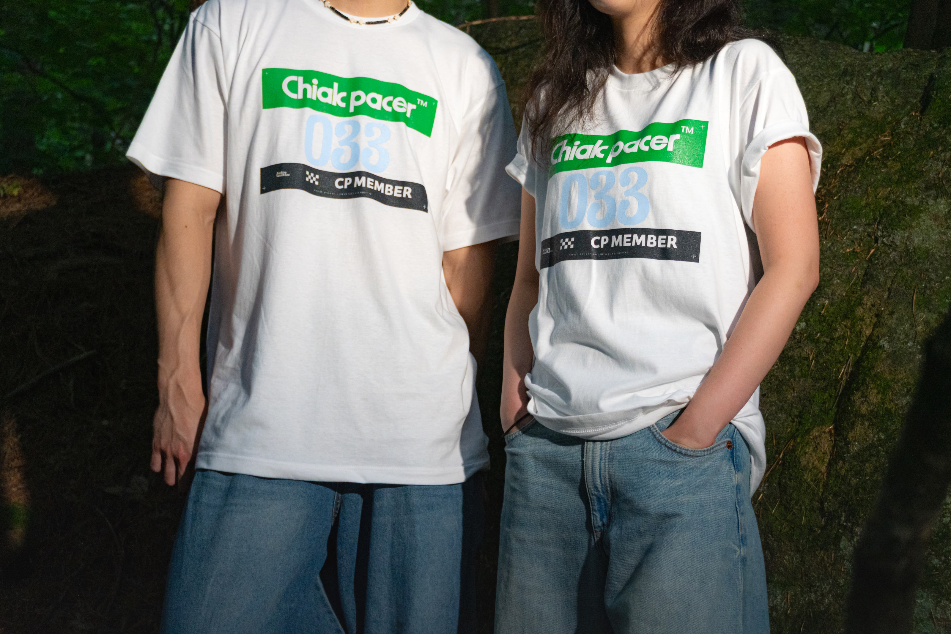
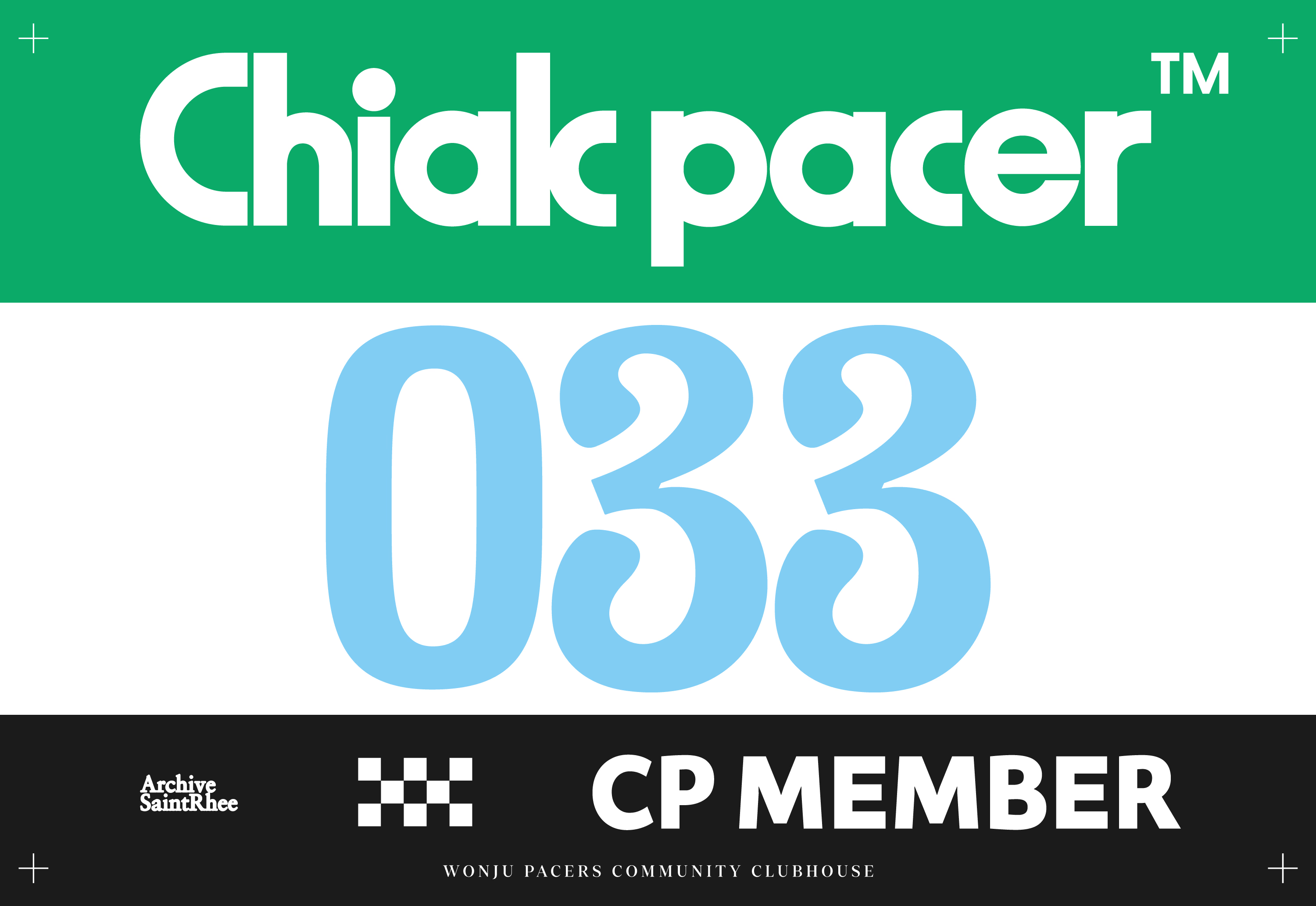
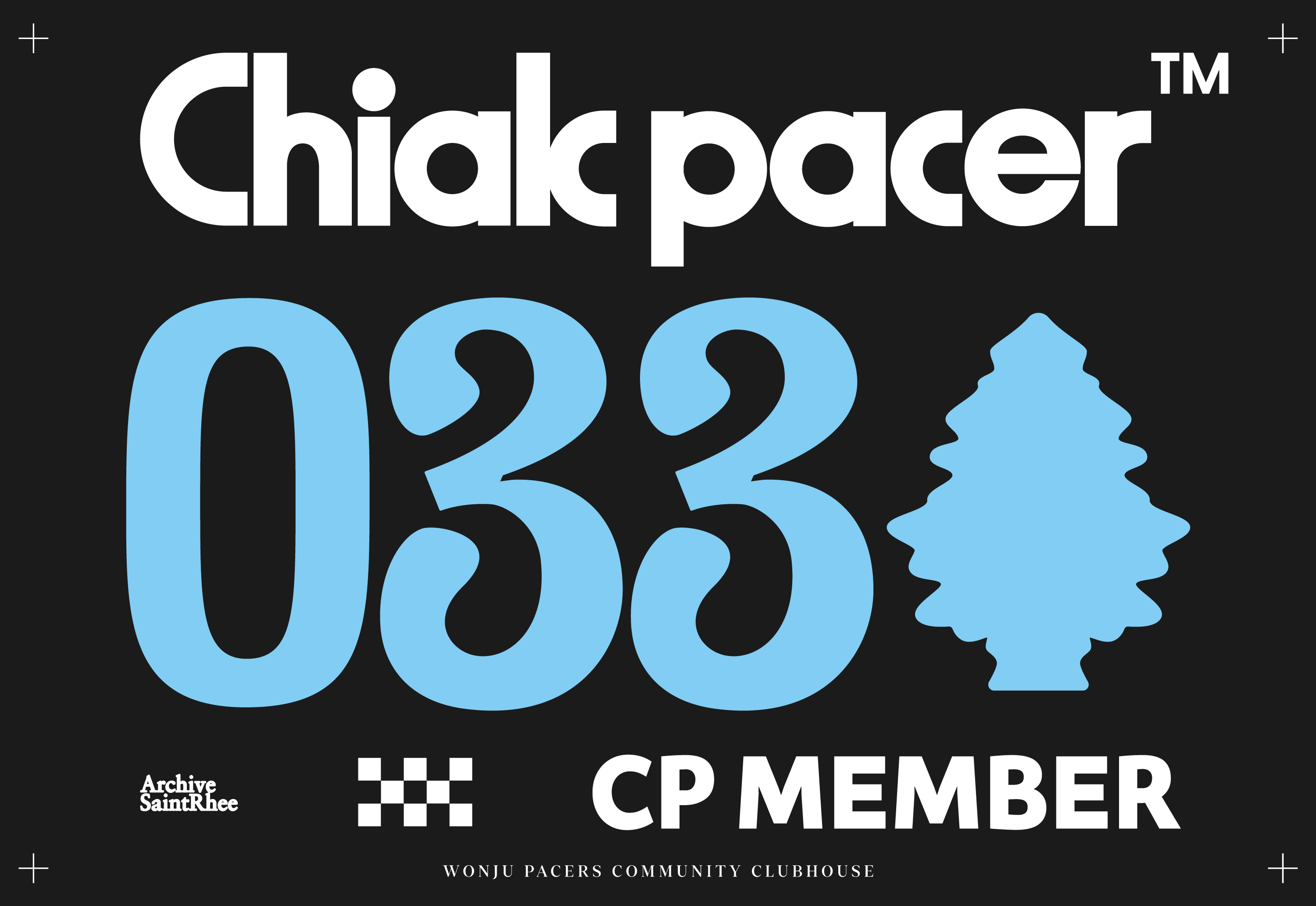
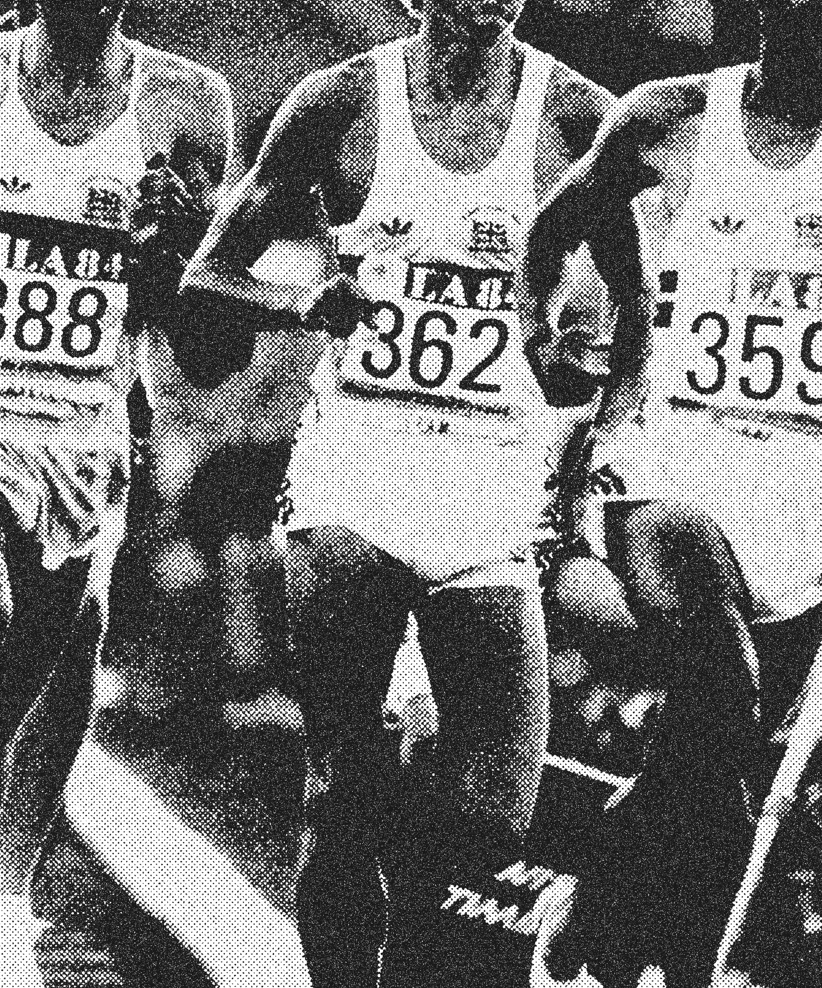
우리는 모두 인생이라는 긴 레이스를 달리고 있습니다. 브랜드의 첫 프로젝트인 ‘033 티셔츠’는 그 여정 속에서 당신에게 부여된 하나의 번호표(Race Bib) 같은 존재입니다. '033'은 강원도의 지역번호이자, 당신이 원주라는 공동체 안에서 함께 달리고 있다는 상징입니다. 디자이너로서 치악페이서의 정체성이 시각적으로 분명히 드러나도록, 단순히 기존 폰트를 사용하는 대신 원주 특유의 도회적이면서도 레트로한 무드에 착안했습니다. 직선의 단단함과 곡선의 유려함을 결합한 커스텀 레터링을 통해, 지역사회에 긍정적인 영향을 주는 모든 사람들에게 ‘나는 치악페이서다’라는 소속감을 전달하는 유니폼을 완성했습니다.
033 Project: A Race Bib for You
We are all running the long race of life. As the brand's inaugural project, the '033 T-shirt' serves as a race bib assigned to you along that journey. '033' is the area code for Gangwon Province and a symbol that you are running together within the community of Wonju. To clearly express Chiak Pacer’s visual identity as a designer, I drew inspiration from Wonju’s distinct urban yet retro mood rather than relying on existing fonts. Through custom lettering that combines the firmness of straight lines with the fluidity of curves, we crafted a uniform designed to give everyone who positively influences the community a proud sense of belonging: "I am a Chiak Pacer."

033 PROJECT
in CHIAK
033 PROJECT
BEHIND SCENE
CREDIT
Visual Director Hanvin RHEE
Photographer Munhyeon NAM
Model Oonjo JEONG, Hanna CHOI, Gyojun HWANG, Sol LEE
© 2026 Pacer. All Rights Reserved.